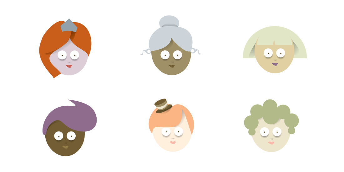
 When it comes to questions of race and minority representation in games, we’re firmly in the “biggest possible tent” camp. The more players see themselves reflected in our game world, the more welcome and comfortable and connected they’ll feel there. As gay folks coming of age in the 80’s and 90’s, we were starved to see members of our community in the popular media, and we’re committed to never make any other group feel like they’re outsiders.
But skin color poses a special issue in a game like “The Eyre Apparent.” If we’re going to be true to the Austenian canon, there really were no folks of color to be seen. Surely literary purists and hard-nosed historians would be apalled to see a rural 18th century English village with the population of a Benneton ad. And we could have used that fact -- that kind of dry analysis of source material to avoid having to consider the issue of race at all. It would have been a defensible (though perhaps not very brave) choice. In the end, we’ve decided to let inclusion trump accuracy. We may well find that some players’ keen sense of authenticity is bruised by this choice, but we’d rather build a welcoming and factually incorrect Austen world than a small, blandly faithful one. Of course, that doesn’t explain why one of the six available skin tones is pale purple, but that’s a post for another day…
1 Comment
 In “Eyre Apparent” we’re working to provide just enough of a sense of place to cue the player without distracting them from the real action going on between the characters. Like a minimalist stage, we want to suggest the Archery club Picnic without having to show every quiver and every folding chair.
By choosing a strong, boldly colored iconic foreground object and running a string of pale, distant background objects, we’re leaving a clear open area for the characters to interact. In a nod to the Hanna Barbera cartoons of our youth, the background art is also being done “roll-of paper” style, with a repeat of simple objects dotted irregularly along the back wall of the imaginary space. Note the intentional letterboxing of the 16:9 cinema aspect down to an even more extremely horizontal 16:7 format. Since we’ll have seven or eight characters “on stage” at any given time, we wanted to focus the player’s attention on the active area, not on the dead space at the top and bottom of the screen. But we can always choose to break our own letterboxing rule and reclaim that space if we need it somewhere, like on a character creation screen. |
AUTHORWorthing and Moncrieff, LLC is an independent developer of video game stories founded in 2015. ARCHIVES
December 2022
|
 RSS Feed
